When a product page underperforms you can stare at bounce‑rate graphs all day and still be baffled. What you need is visual evidence, a heatmap that shows the cold zones visitors ignore and a session recording that reveals why they rage-click an innocent image. Microsoft Clarity gives you that forensic proof, completely free and with no traffic limits.
This guide combines a battle‑tested setup checklist with a library of actionable insight examples so you can move from “Hmm, that’s odd” to “Here’s exactly how we’ll fix it.”
1. Why Heatmaps Beat Raw Metrics
Traditional analytics report that “users bounce.” Heatmaps explain where their attention fades, and recordings illustrate how frustration builds. Pair the two and you can:
- Lift under‑clicked CTAs above the fold.
- Discover buttons that only desktop users ever see.
- Spot broken scripts the moment they sabotage checkout.
Pro Tip: Tag each insight with an impact score (High / Medium / Low) so your dev team always tackles the most profitable fixes first.
2. Fast‑Track Installation
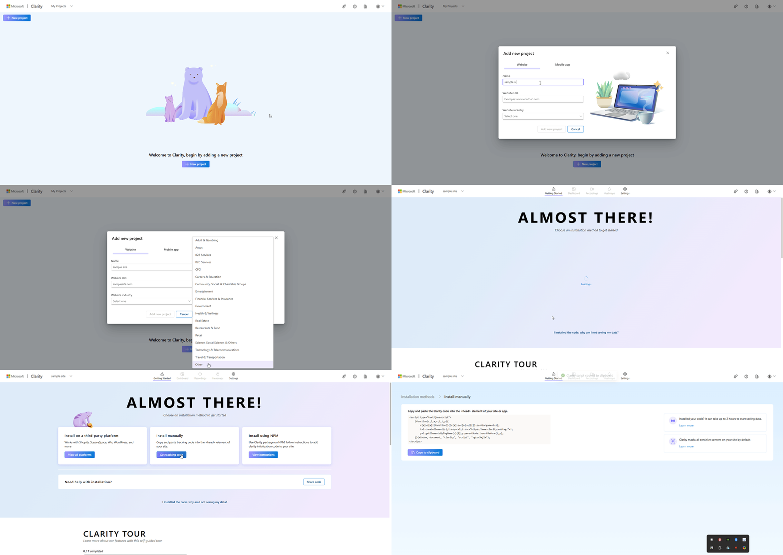
1. Create a project
- Sign in at https://clarity.microsoft.com
- Click Add Project, enter your site URL and hit Create
2. Copy the tracking snippet Clarity generates.
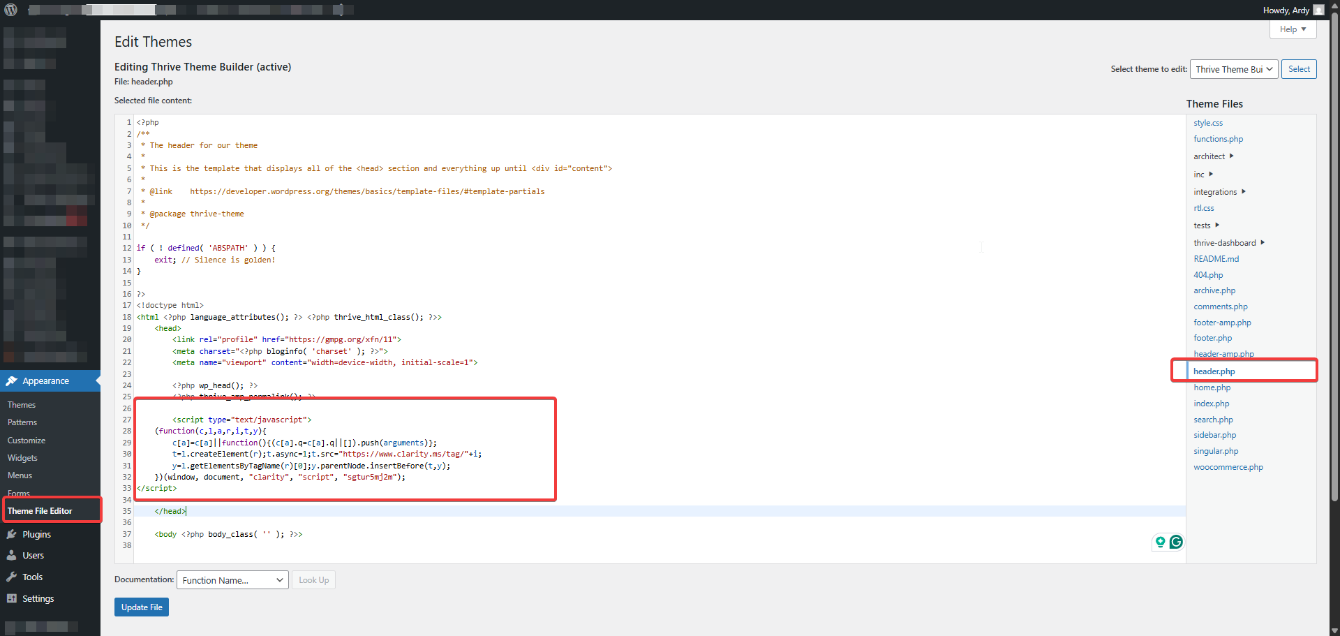
3. Paste the snippet just before </head>
|
Platform |
Where to paste the code |
|---|---|
|
WordPress |
Header‑script plugin or header.php |
|
Shopify |
theme.liquid |
|
Wix / Squarespace |
Site Settings → Custom Code |
|
Google Tag Manager |
Custom HTML tag on All Pages |
4 .Verify
- Reload any page, wait a few minutes, and your project status flips to Active
3. Master Setup & Analysis Checklist
Use this grid to bullet‑proof every phase installation, exploration, smart filters and documentation.
Not sure where to start?
We help businesses build marketing systems that actually work. Let us show you how.
Get Your Free Growth Plan →|
Phase |
Task |
Done? |
|---|---|---|
|
Install |
Snippet added before </head> |
☐ |
| Cell |
Domain verified as Active |
☐ |
|
Explore |
Heatmaps generated for Top‑10 pages |
☐ |
| Cell |
Scrollmap checked for key templates |
☐ |
|
Filter |
Scrollmap checked for key templates |
☐ |
| Cell |
Device & browser segments saved |
☐ |
|
Document |
Screenshots annotated & stored in drive |
☐ |
| Cell |
Findings logged in CRO tracker |
☐ |
4. Reading Heatmaps Like a UX Detective
4.1 Core Heatmap Views
|
View |
What It Shows |
Why You Care |
|---|---|---|
|
Click / Tap |
Hotspots of interaction |
Are visitors clicking non‑links? Are CTAs ice‑cold? |
|
Area |
Engagement by section |
Decides which modules deserve premium space |
|
Scroll |
Average fold & drop‑off cliffs |
Reveals buried content or modals stalling progress |
4.2 Immediate Red Flags
- Hero image overloaded with clicks but no link – Wrap it in an <a> tag or overlay a bold CTA.
- Primary CTA below 40 % scroll depth – Relocate higher or add a sticky header.
- Mobile users pinch‑zoom nav icons – Expand tap targets to at least 48 × 48 px.
5. Power Filters & Recording Workflows
|
Filter |
Insight Example |
Typical Remedy |
|---|---|---|
|
Rage Clicks |
Rapid taps on a static image |
Make it interactive or label clearly |
|
JavaScript Errors |
Script fails on checkout → users reload |
Debug, retest, redeploy |
|
Exit Page |
Mass drop‑off at /cart/discount-code |
Auto‑apply coupons or simplify field |
|
Device |
Mobile users see only 55 % of desktop scroll depth |
Shorten content & move CTA up |
Recording Efficiency Hacks
- Enable Skip Inactivity.
- Playback at 1.5× speed.
- Tag sessions with a clear label (e.g., “iPhone 15 – Rage on Payment”).
6. Real‑World Insight Library
6.1 Heatmap & Scrollmap Examples
|
Scenario |
What You Learn |
Next Step |
|---|---|---|
|
User‑Engagement Gap (Heatmap) |
Visitors click a decorative banner that’s non‑interactive |
Turn banner into a category link or add a “Shop Now” button |
|
Scroll‑Depth Cliff (Scrollmap) |
60 % stop scrolling halfway down |
Relocate primary CTA higher; compress intro copy |
|
Low‑Clicked Subscription CTA |
Newsletter button barely registers clicks |
Enlarge button, switch colour, or add a 10 %‑off incentive |
6.2 Session‑Recording Examples
|
Scenario |
Friction Point |
Action |
|---|---|---|
|
Frustration Clicks |
Rage taps on non‑clickable product image |
Add zoom feature or View Details link |
|
Navigation Hunt |
Users abandon checkout looking for promo field |
Auto‑expand promo field earlier in funnel |
|
Mobile Usability= |
Tiny nav buttons cause repeated taps |
Redesign nav with 48 × 48 px buttons & spacing |
7. Turn Findings into Wins: A 7‑Step Action Cycle
- Flag the Issue – Save the heatmap snapshot or label the recording.
- Quantify Impact – Pair Clarity segments with GA4 revenue to size the lift.
- Brainstorm Solutions – Gather dev, design & CRO copywriter.
- Implement – Ship behind a feature flag where possible.
- Set a Benchmark Date – Capture fresh heatmaps two weeks post‑deploy.
- Compare Before / After – Overlay both views in a slide deck.
- Document & Rinse – Log outcome, mark resolved or iterate again.
8. FAQs & Troubleshooting
Conclusion
Installing Clarity takes minutes; mastering it takes practice. With the checklist, examples, and action cycle above, you’ll move from visitor curiosity to validated UX wins faster than any spreadsheet can manage.